
Tenebroso Pieta
Oil on wood panel
23 x 17
I would be hard pressed to overestimate the importance of this picture with regard to my development as an artist and within my work as a whole. I am continually striving to unite all of my sensibilities as an artist in the service of a personal aesthetic. This piece represents a new level in the combination of all of these elements, such as compositional power, technique, figure poses, color, and so forth. I have always felt that a piece works best when all of these elements heighten the visual idea and that is why I am so pleased with this particular painting. The pose was originally inspired by my studies of Michelangelo's Rondadini and Palestrina Pietas in which the figures are shown vertically rather than the traditional horizontal or recumbent attitudes. Verticle is naturally a dramatic posture and I have tried to accentuate the physical and spiritual closeness of Mother and Child by turning the two parties face to face. Also contributing to the spiritual quality of the design is the gentle touch with which the Mother holds her Son; so gentle in fact that She would physically be unable to support the weight, but the gesture is significant and appropriate for the picture. True to the tendencies I have towards a more Mannerist design sense is the great feeling of darkness within this picture, which upon further investigation becomes a little ambiguous. The flat black becomes decorative rather than obfuscating; less like shadow and more like an element conscious of its job to enhance the linear elements of the picture.

Irene Discovering Saint Sebastian
Oil on panel
29.25 x 23.25
I have always been inspired and challenged by Mannerist art. Italy is of course the major area of study, but a lesser known and especially interesting area of study for me has been the art of late Renaissance, proto-Baroque, Spanish and Neapolitan art. There was a tendency at that time for some artists to combine elegant formal traits of courtly and high ecclesiastical art with the immediacy and power of the Caravaggisti and Tenebrists. This has been a starting point for me of late and is particularly apparent in this, one of my most successful works. Where I begin to deviate from the manner employed by artists of that time like Cavallino and Ribera starts with the extreme lack of situational detail. Next, for me the aesthetic choice of a dark manner is to heighten the linear pattern of the composition, for the earlier painters their use of dark was to emphasize depth and shadow. The shadow and atmospheric quality is no doubt imperative to my work, but the main focus is to use the black like a solid presence, that describes the line and silhouette even while it completely envelopes other areas.
In this version the form of the Saint is seen in twisted pain, highlighted at the foot of two trees with a single arrow piercing his breast. On the scene arrives Irene, but it is a quite arrival, without theatrics. Everything is subdued, yet the color scheme quietly glows and the protagonists play out the action against a sky that glows like embers. Irene seems to merge with the two trees and create a strong monumental quality. Combining this vertical with the horizontal foreground I was able to offset the composition thus giving a unique view and heightening the impact of the sky. Sebastian is a powerful form, an internal struggle made visible, and thought he is half enshrouded by the darkness, a darkness that seems palpable and against which he appears to struggle, the picture plane does not absorb the Saint but pushes him forward.
Oil on panel
29.25 x 23.25

Resurrection
SOLD
Oil on canvas mounted on wood
17.5 diameter
While the watercolor version of this work concentrates on the movement made apparent by the interplay of the convex and concave elements, this oil version focuses on the weight and power of the form arising from the cloth. Of course the same compositional elements are present in both works, but it is amazing how the emphasis can shift when the medium is changed and a new aesthetic direction is explored. In truth, that is a current which returns again and again in my work, especially now, as it is a special challenge to treat themes in various media. In this oil a very tactile technical approach has given the figure a powerful presence as he bursts forth from the darkness of the grave. The draperies billow and seem to open up like flower petals. Again the darkness around the figure describes more than it hides and the whole reads like an elegant symbol, emphasized by the round shape. Incidentally, the round shape was traditionally used in Renaissance and Mannerist Italy to indicate a gift. The choice of this shape was very much a conscious one in light of the deepest meanings of the subject. The colors, which at first seem quite lively, actually manage to have quite a weight to them through the use of numerous glazes which play nicely against the impasto sky.
I actually did the round frame insert myself, gold leafing it over an incised pattern. Then it was antiqued and brushed heavily, especially over the inscribed pattern to allow the hand tinted priming to show through. The effect seems to be one of a precious yet aged object, made whole by combining it with the art work.
Oil on canvas mounted on wood
17.5" diameter

Crucifix
Oil, Pastel, and Dry Pigment on Canvas
40 x 36
I have said elsewhere that art is in some ways experimentation. That is, seeing what works visually as well as what works technically. Without a continuous regeneration of approaches, both subtle and extreme, even the most divergent compositions can become stale. I try to keep this in mind, and as a result I am constantly changing my techniques - or perhaps more accurately I am enhancing them by looking for techniques and variations of techniques that speak to a specific design.
Thus the manner used for the Crucifix. It was painted almost entirely with my fingers, by blending and rubbing the paint and pastel as well as the dry pigment into the canvas. It is a very severe result, but successful for this conception. I don't use this method often but there are other planned images and even variations on this technique.
This composition was inspired in part by the great French sculptor Francois Rude who created an intentionally truncated figure of Christ for a Crucifix. This compositional treatment quickly engages the viewer in a very empathetic way.

Scarecrow
SOLD
oil on canvas
43 x 30.5

Paolo and Francesca
SOLD
Oil on canvas
14 x 11
This started as an idea for a commission to be done on a wall in a variation of the fresco technique. To approximate that effect the oil paint was mixed then strained through cheesecloth to achieve the dry, matte finish. Unfortunately the commission fell through, but this study exists on its own as a finished piece.
The subject comes from Dante's Inferno. Dante meets the doomed lovers in the second circle of Hell and learns that while Francesca da Rimini was betrothed to the deformed Giancotto Malatesta she succumbs to desire with Paolo, Giancotto's brother, while reading about the illicit kiss between Guinevere and Lancelot. Giancotto discovers the pair and slays them.
Dropping the prurient overtones and guilt laden coyness of Victorian representations, I concentrated on the visual possibilities of the embrace of the two lovers. The composition is severely frontal and decorative, helping to make the sexual overtones more subtle and thus Giancotto's head peering in from behind the curtain makes him appear less the offended and more the offender.

Saint Andrew
SOLD
Oil on canvas
23.75 x 20.25
For something that on the surface appears so simple there is actually quite a bit within this image. Despite how it sounds, I will always feel that this is one of my most perfect compositions. I have always tried to expand on the repertoire of poses utilized by painters to represent certain events and it is no exception with St. Andrew, who I have painted numerous times. Typically this patron Saint of Greece and Scotland has been shown spread eagle on the X shaped cross, the form of his martyrdom. As is my practice I wanted a less narrative representation and a much more symbolic image. I also wanted an image that would explore the emotional potency of the figure through a pose and more importantly through the ebb and flow of a type of Florentine line that would define the figure. The figure would also take up the underlying geometry, which would ultimately unite the entire composition, and yet remain a moving and elegant form in a mannerist tradition. Saint Andrew is realistic in coloration and modeling and yet he hangs in a manner that would not really support his weight in such a way. The flesh wrinkles and folds naturally enough but the huge thigh with the beautiful arabesque line would make him a virtual giant with a somewhat smallish head were he to stand. However, these tensions and mannerisms are what make it such a moving and arresting image, especially when combined with the colors employed. The blue was agonizingly worked out to create the most powerful impact with both the warm flesh tones and the elegant, otherworldly green of the cloth. The cloth also continues the geometric underpinnings as it visually completes the circle of the central part of the picture, a circle which is then locked in to place like a bull's-eye by the wooden cross pieces. The cross pieces are themselves countered at regular intervals by legs, cloth and torso. The whole is worked out to the least detail, similar to the most intellectual of Pousin's works, without becoming cold or severe.
The frame itself is perfectly suited to the piece and was hand finished in Italy with a unique acid wash.

Resurrected Christ
SOLD
Oil on wood panel
19 x 12
This is a very early work, and one that is quite elegant in its simplicity. So much of it is inspired by the work of Michelangelo, from the conception to the pose. Michelangelo probably initiated the theme of the Risen Christ holding a symbolic cross when he carved the sculpture that is now in Santa Maria Sopra Minerva. It has long been neglected by historians, yet to me it is a powerful conception and is related to the way I like to think of composing, that is, a very focused figure or figures whose emotional content and physical energy are inextricable. Designs like this become quite symbolic, and perhaps more stimulating to the viewer because they are not just narratives.
The pose is somewhat of a quotation of Saint Andrew in the Last Judgment fresco, although made to look more ethereal, a marble figure made to look like flesh but still pale from the grave. The contrapasto, or turn of the figure, is slightly less tense; as if the struggle over death has left him exhausted, leaning on the symbol of His martyrdom, and hardly able to get free of the rocks of the tomb. The nudity is no shame; it has the sense of a Greek athlete, or like a new born. The death shroud is gone, replaced by the blood red hood that balances a very stark composition. Again, this is a symbol victory not a narrative.

Christ Figure
SOLD
Oil on canvas
22 x 18
Sometimes paintings have to take shape their own way. Most of the time my paintings are thought out, planned well in advance, and many studies done in preparation. This oil is unique in that it followed its own course and as a result has become one of my favorite pieces. I originally started it as a study for a larger picture that I was planning. The larger picture was altered but I was fascinated by what was developing in the painted sketch. At this point I began to experiment technically, using an extremely liquid glaze over the under paint then working in highlights of paint that I had ground with a minimum of oil. That was almost all it needed; the figure isolated against a virtually untouched background had an elegant simplicity of which I have always been fond. The drapery was then added to further define the figure in its space and to heighten the subtle nuances of color and value. The drapery elements were also painted in a very fluid manner using a very liquid glaze then dragging thick, stiff paint into it with the palette knife. It is this combination of fresh, impetuous brushwork against the simplicity of the composition that makes this piece work.

Saint Anthony In The Desert
SOLD
Oil on canvas
22 x 18
This picture is related to the Saint Sebastian, Paolo and Francesca, and Saint James of the same style. They were all done as studies for a commission to be painted on walls using a variation of the fresco technique; therefore the paint was strained through cheesecloth to approximate the anticipated matte finish. Although the commission was never carried out the sketches were completed in such form that they exist by themselves as finished pieces.
Along with Paolo and Francesca this may be the most conceptually complicated of the series. As is my habit however, I have culled the subject down to its minimum by eliminating much superfluous detail, if one can call it that. It is obvious that the hermit Saint is wrestling with the hallucinations that the stories tell us afflicted him, but there is more than that. The Saint is no old man, bulls which from ancient times through Picasso have been viewed as symbols of sexual power, and the figure twisted around Saint Anthony are a bizarre combination of the seductive and violent, demonic and corporeal. There is much tension in the poses of the central figures but they exist in an almost flatly decorative world. It is dizzying and in a way effective as the picture becomes our own hallucination and not the Saint's.

Saint James
Oil on canvas mounted on wood
18.25 x 16.5
This picture is related to the Saint Anthony, Paolo and Francesca, and Saint Sebastian of the same style. They were all done as studies for a commission to be painted on walls using a variation of the fresco technique; therefore the paint was strained through cheesecloth to approximate the anticipated matte finish. Although the commission was never carried out the sketches were completed in such form that they exist by themselves as finished pieces.
One would hardly know that this image is of Saint James were it not for the walled city ghostly silhouetted in the background and that is alright. I have never much cared for conceptions in which everything is spilled out right there on the canvas. Most viewers of art bring their own preconceptions to looking at a piece and begin almost immediately to relate to it in their own terms. I try to give them flexibility to interpret on their own terms while subtly directing them towards a feeling or sense by utilizing design and drawing as well as poses and technique. This approach is paramount in Saint James. Most traditional art of the past several hundred years tells us there should be shadows and yet in this picture there are none, and even more disconcerting is the fact the Saint's body is flesh and completely modeled. Certain areas are left completely unpainted: the head for instance, is it a skullcap or a foreshadowing of his decapitation told of in legend? Though a city looms in the background everything is flat except for the very palpable body that rests as on a stage. All of these factors engage the viewer, begging he or she to ask questions and in the best cases to mentally answer themselves based on their own unique views.

Saint Sebastian
Oil on canvas mounted on wood
23.5 x 20.5
This picture is related to the Saint Anthony, Paolo and Francesca, and Saint James of the same style. They were all done as studies for a commission to be painted on walls using a variation of the fresco technique; therefore the paint was strained through cheesecloth to approximate the anticipated matte finish. Although the commission was never carried out, the sketches were completed in such form that they exist by themselves as finished pieces.
This was the very first sketch done and is perhaps the simplest. However, this simplicity is one of its greatest assets, creating a starkness in which the figure seems to inhabit, as if on stage. The intentional lack of shadow and the ghostly white areas where no paint is applied continue throughout the series and generate a very surreal atmosphere. This otherworldliness is not inappropriate for a group of pictures that deal with Saints unaffected by arrows or tormented by visions, as well as a couple whose story is told by a poet who meets the lovers in Hell.

Tenebroso Crucifixion
SOLD
Oil & Gold Leaf on wood panel
21 x 17.25
I have always regarded Michelangelo as the ultimate artist, so much so that the next artist, in my opinion, is a distant second. His immeasurable individuality never ceases to amaze me and I think often of a particular time in his career. In the middle of his life, while others were concerned primarily with creating depth and realism in their 2 dimensional works, Michelangelo in a sense "regressed," if one can use such a word when talking about this particular artist. He returned to the expressive qualities of medieval and trecento art, not that his figures ever lost any of their corporeal presence and his mastery of line never wavered, rather his designs really became quite planar and aggressively engaged the viewer both visually as well as emotionally. The Crucifixion drawings from this period of Michelangelo's career are truly some of the most beautiful drawings ever done. His monumental figure characterizations married to an archaic stylization, an "expressive decorativeness" if you will, (some of his drawings were primed for, or show the remains of gold leaf!) had a direct effect on the developing mannerism. However, the tendency towards naturalism prevailed in the Baroque age and dominated for the following 300 years.
All of this is a long way of saying that here is evidence of the type of aesthetic that truly moves me and which I am attempting to pursue, especially in this piece. It is very unusual to see a mixture of oil paint and "archaic" styled gold leafing. I use the technique for several reasons, not the least of which is to heighten the spiritual impact, that "expressive decorativeness." This element makes a wonderful contrast to the palpable figure of Christ and the somber atmosphere of the background. Finally, the line is still of the utmost importance as it undulates and disperses in the darkness only to congeal again in the silhouettes.

Face of a Saint (Saint Philip)
SOLD
Oil on canvas mounted on wood
10 x 7.5
Most of the work I do is actually very thought out and labor, as well as thought intensive. I normally do several sketches and figure studies before I ever begin to work on the final piece. However, from time to time I do "let go" and work relatively free. Such is the case with this small painting. It is neither a study nor associated with any other work, it simply is. In the past I have tried to leave numerous small panels laying around ready to do impromptu sketches in oil, but I got out of that habit. I am happy that I have recently returned to that practice, this work being one of the initial results. Very few make it out of the studio, but this is one of my favorites. What is interesting about this painting is that it was entirely spontaneous, so spontaneous in fact that it was painted entirely with my fingers and then a broken brush handle to drag through the wet paint hinting at wrinkles.

The Deluge
SOLD
Oil on wood panel
15.25 x 18
The Deluge is closely related to another piece, The Destruction of Sodom and Gomorrah, in that they are both representations of figures in the extremes of pathos and tension. This type of subject is of particular interest to me, allowing me to satisfy my aesthetic of putting the human form in expressive poses and relegating the story to the background. In this painting one still sees the cause of so much exertion and resignation in the turbulent waves at the bottom of the work. However, like most of my work, I am not really commenting on God's great wrath, rather the theme is a psychic expression made physical. In this instance the poses and composition speak of a humanity in distress and their reactions, be they fear or expiration, and to a great extent in this picture a certain obliviousness to their fellows. The connection to an underlining story is blurry here and really begins to disappear in the Sodom and Gomorrah piece.
Aesthetically, even for a relatively early piece one can see my predilection for pushing the figures forward in the picture plane. This is achieved by isolating them against the flat strip of stylized rock that runs through the composition. Technically there is a nice translucence created by using many layers of thin glazes.

The Destruction of Sodom and Gomorrah
Oil on canvas
48 x 60
In my notes to The Deluge I spoke of my fondness for this type of conception and the challenge and inspiration it gives me to compose using multiple figures. I also mentioned how the story is of secondary importance, the main theme being the pathos generated by the poses. It is especially true in this instance, where the narrative content all but vanishes. I am not making a statement other than the sublimity and tension inherent in the story and made visible as a weaving of the forms in a mannerist way. In some ways, when designs truly succeed they actually complicate the "reading" of a piece by eliciting so many contradictory feelings - fear and comfort, rebellion and resignation.
So fond of this type of composition am I that my sketchbooks literally overflow with intertwined figures and their various permutations. Several large-scale versions are in development and in these instances the narrative base is completely gone, they exist for themselves. They have outgrown the need for a point of origin and thus have become truly universal.

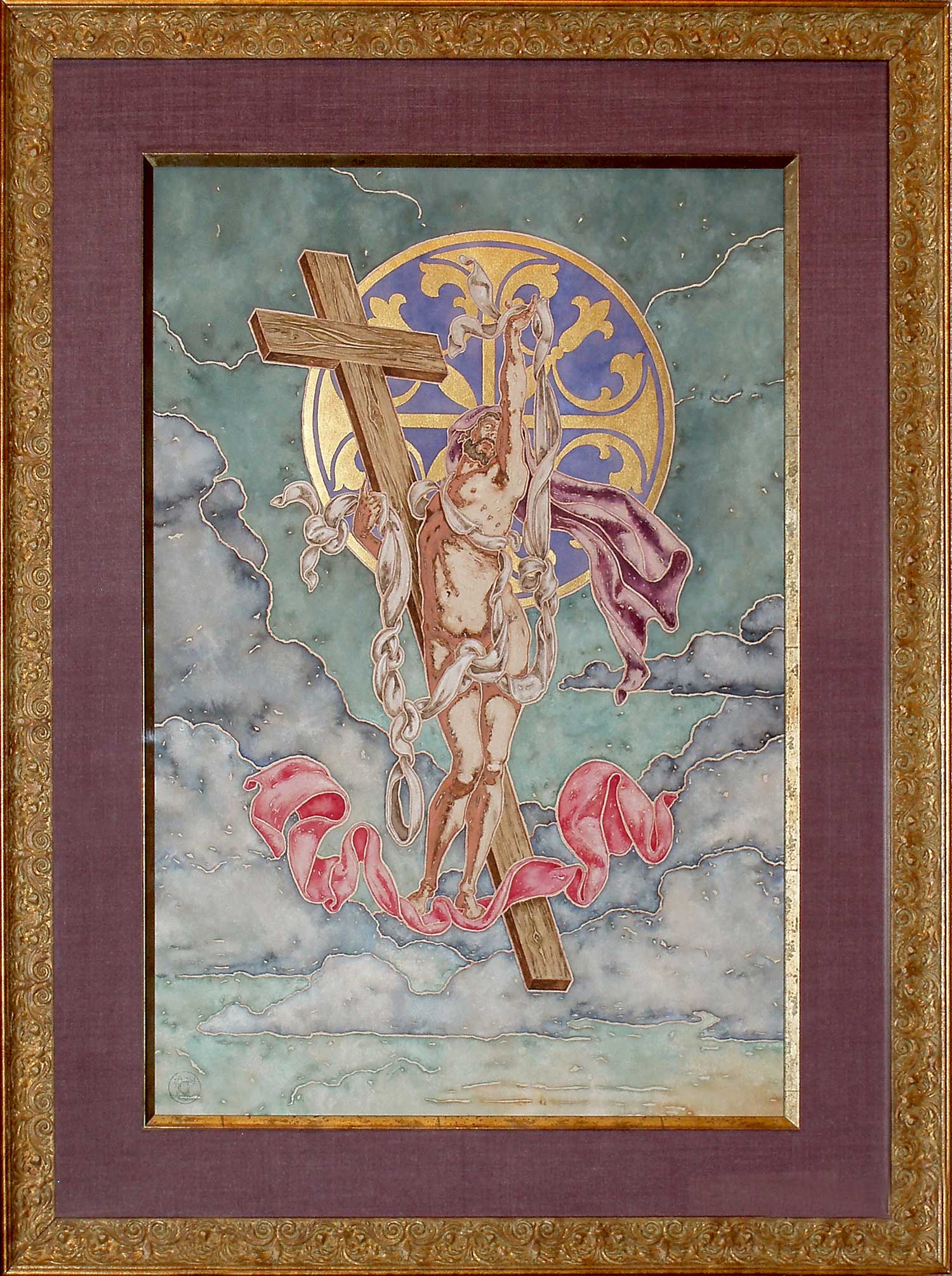
The Great Sky Crucifixion
Watercolor
Image Size 49 x 32
Frame designed by Randall M. Good
I will never be accused of being a landscape painter. However, it is important in my work that my images have a frame of reference, that even though they are site "unspecific" they are not "nowhere" backgrounds. At their best, they heighten the visual impact of the main theme of all my pieces - the figure. This quality is of the utmost importance in this work, where I try to call up an almost cosmic feeling akin to the works that loosely inspired it, pieces by Albrecht Altdorfer and Pieter Bruegel. Though the figure resides low and small in the composition it is no way diminished, rather the tragic and heroic, that which we call human is emphasized.

Crucifix
SOLD
Watercolor and gold leaf
17.5 x 14.75
To my mind, the two most perfect compositions and subjects to which I return repeatedly are the Crucifixion and the Pieta. For my style and aesthetic sensibilities both subjects offer an inexhaustible source of poses and tensions, pathos and feeling. My approach to the body is such that I seek out the descriptive and emotional potential through the arabesque and rhythmic nature of a Florentine type of line. Using this technique on this painting and by forcing the figure to the very limit of the frontal plane by focusing on the torso, the viewer is almost immediately engaged. As for the pose, the original idea when working with the model was to have the head upturned in a longing way, however the image never quite seemed right. The resolution came with the exhausted dropping of the head; the emotion read nicely and it proved to be the perfect contrasting movement to the upward lift of the arms.
Resurrected Christ
SOLD
Watercolor

The Rose Pieta
SOLD
Watercolor and gold leaf
28 x 20.5
From the very beginning this picture was to have a Florentine richness about it, but it was to maintain the pathos inherent in the subject. The Florentine quality begins with the tight construction of the Madonna and Christ. It is emotional and highly stylized. She could no doubt hold Her Son like this, yet everything is planar, pushed to the front and emphasizing the flowing contours of the line. The composition is locked in place by the series of verticals and horizontals that run through the picture. The strong vertical element of the Honor Cloth adds drama and metaphorical power to the piece, particularly in the way that the flower and decorative elements compliment the subject both visually as well as in the iconography. Color plays an important role in establishing the feel of the piece as it serves a symbolic more than a descriptive purpose. The numerous reds that hint at blood as well as the bruised looking sky seem ominous and yet they enhance the vivid quality of the nude and add to the overall richness of the work, especially when combined with the gold elements. The paint is allowed to move across the surface and the broken patches lend it a feeling very much like a small precious tapestry.
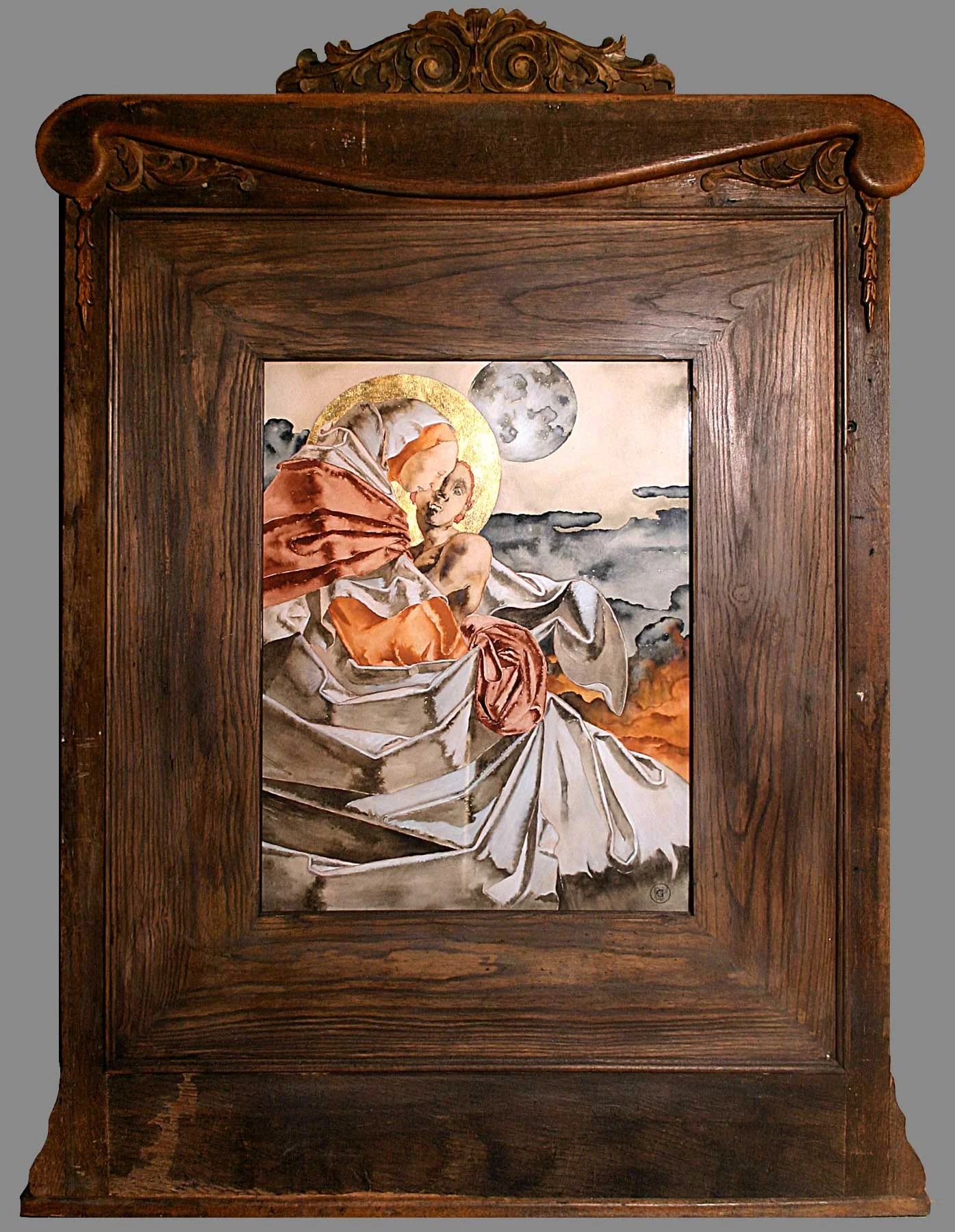
The Moon Pieta
SOLD
Watercolor and Gold Leaf
25.25 x 19.75
The Pieta, where Mary cradles the dead body of Her Son, is, as I have stated, one of my favorite subjects. However, this interpretation is different in a couple of ways. Firstly, most of my pieces are worked on for great lengths of time, labored, and explored; whereas this painting absorbed me from the beginning, and from conception to completion it was the only piece on which I worked. Secondly, my other interpretations tend to focus on the linear rhythms and pathos of Christ's nude figure, while this one concentrates on the tenderness and protective nature with which The Virgin envelopes Her Son in the monumental drapery. The moon in the piece is both symbolic and compositional, an emblem of the great darkness of the land at Jesus' death, and also a soft contrast to the hard edged cloth as well as a compliment to the halo that encircles the nearness of the two players.

Archangel Michael
SOLD
Watercolor and gold leaf
40 x 28
It is hard to know where to start with this particular piece. I knew I wanted to portray Michael, but I wanted the work to be vastly different from traditional representations of Him vanquishing Satan and so forth. I gravitated quickly to the unique tendency in Mannerist practice of combining a simplified, natural quality with a hierarchical, almost Gothic formality of composition. This gives the picture a power and grace that is then multiplied by the huge wings that almost pinion the figure to the center and very front of the picture plane. This novel approach to the treatment of the wings, including the use of four large wings rather than two tiny ones, emphasizes the true power of the Angel, the symbol of the Church militant and judge of souls, the latter role indicated by the scale half hidden by the figure's weight bearing hip. To say weight bearing is misleading, it is just another compositional device to add strength to the figure, anchored yet rising triumphantly against the sky. To prevent a stifling severity the figure is given a subtle grace and a half-feminine/half-leonine head.
I designed the frame especially for this piece. It was built by Charles Mayfield Woodworking in Denton, Texas. Some of the inspiration comes from the Laurentian Complex designs by Michelangelo. The suspending corbels and attached pilasters without capitals have a Mannerist feel which compliments the image.

Charity
SOLD
Watercolor with 22, 22.5 and 23 karat gold leaf
Hand distressed with gold leaf and acid color washes. Linen fabric wrapped mat. Italian frame by Roma. Conservation mounted.
Image size 25 x 18.5
Frame size 42 x 35.5
The subject of Charity may be considered an allegorical image, though its origin is specifically from the three theological virtues of the church. These include faith, hope and charity, the last being chief. Charity has been a popular subject throughout the ages, although the present form of a woman nursing and protecting three infants was devised and became the predominant version around the 16th century. The visual representation of Charity is a unification of the image of the Virgo Lactans with the central concepts of love for God as exemplified in love for one’s neighbor. In my conception all of these aspects are present: the woman, giving herself wholly to the infants (commonly understood as born of another woman), thus taking care of their earthly, physical needs shall be rewarded in Heaven as alluded to in the shimmering gold leaf background. A quick note on the gold leaf – the grid like pattern makes a nice backdrop against the organic shapes of the tree and figures. Instead of using a single type of leaf I employed three different grades, all of a slightly different karat and color thus adding to the subtlety of the piece. I will also say that there is significance in the dead appearance of the tree as well as the single broken branch, the only one with any leaves at all and totaling seven, and held by the second infant. Though these elements have a particular meaning for me, they can and should mean different things to everyone, as we all have our own experiences and ideas - there in lays the greatness of art.

Pieta
SOLD
Watercolor
25.25 x 17.25
It is apparent how much I like this composition from the fact that I have treated it in oil, watercolor, and several drawings. I do love this design, but I often work a piece in several different mediums. When I do this it does not detract from the other pieces, one does not become more important than another. I have always felt that it is a great treat to be able to work and rework a successful design and see the different feelings and qualities you can achieve. The oil version of this composition makes extensive use of shading and line play to create a sense of quiet monumentality. The color compliments that association. In the watercolor the sense of movement is enhanced and the vibrant color is central to the drama: the same starting point but two very different feelings.
Although the watercolor heightens the feeling of movement none of the power of the pose is lost. Unlike traditional representations of Pietas in which the protagonists are dispersed horizontally this design takes a cue from Michelangelo's Rondadini and Palestrina Pietas. The figures are shown vertically and to emphasize the spiritual closeness of Mother and Son I have turned them face-to-face as the bodies almost float, suspended against a tumultuous sky. Pieta actually means Pity, and although the composition is easily recognizable in the western tradition of religious art I have intentionally left out obvious symbols. The true meaning lies in the universal truths of love, devotion, sacrifice, loss, and hope.

Irene Discovering Saint Sebastian
Watercolor
28.5 x 23.5
Legend has it that after the Romans made their first attempt at martyring Sebastian, he was discovered and nursed back to health by Irene. Quite often Irene is referred to as a Saint, however she was never actually canonized. Nevertheless, the subject has been portrayed numerous times by artists throughout history.
This interpretation is, for me, rather classic in the sense that the composition is closely related to many Renaissance and Baroque forerunners. However, it begins to deviate in the actual aesthetic treatment and the posture of the Saint. Firstly, the technical treatment is to some extent experimental. The very dark foreground isolates the figure against the very lightly applied background. This generates an almost backlighting affect, but more importantly it intensifies the main preoccupation of my work, namely the play of line, whether it be line by itself or as a type of contour silhouette. The very dark manner that I return to again and again is not, like a true tenebrist, a mode to generate deep shadowy recessions but for me a means to exaggerate the patterns and rhythm created by the line. The figure of Sebastian is truly mannerist, a pulsating knot of tension rising out of his foreground space yet constricted within the planar constructs of the composition. The strong vertical elements of Irene and the trees help to intensify the tension created by the Saint's pose.

Latin Crucifixion
Watercolor and silver leaf
Hand distressed Italian frame with black linen wrapped mat Conservation mounted
Image size 25.5 x 17
Frame size 39.5” x 31
In many ways art is an experiment. One picks colors, juggles shapes, and accepts or rejects ideas according to their success. So it is with this picture in particular. I had success with other works utilizing very dark areas, with the indistinct yet subjectively moving "backgrounds," and using gold leaf. However, in this picture the dark area is not used as a background shadow but as a rhythmic pattern unto itself, somewhat merging figure and cross into one. This form is then cast against an increasingly abstract, or more accurately an unspecific background; a tendency I have always had and which seems to be growing stronger in conviction as I search for ways to push my figures further into the foreground. Finally, the choice of silver leaf rather than gold was aesthetic as well as an experiment in appropriateness - somehow silver evokes light and purity, an ideal contrast to the somber upright of the cross.
Religion
Click on an image and then the round button in the lower right corner for more information and to switch between full and detail views of the image.